


What is a responsive web design and why you should care?
What is a responsive web design, and why should you care?
According to recent data, a staggering 78% of us use a mobile device to access the internet. To put that into context, just three years ago (that is in 2018), 72% of the population used a smartphone as the most common device to access the internet.
When compared with the data in 2013, that’s a massive 53% increase! Therefore, it is clear that how we access the internet has become so diverse that computers are no longer the primary device we use to access information online.
This is where responsive web design becomes crucial for businesses, not just in Leicester, but for companies of all sizes worldwide. The key for anyone embarking on a new web design project is to ensure that their website loads seamlessly on all devices. So, how can you be sure your website will have a responsive design?
The definition of ‘responsive web design’
In simple terms, a website is said to have a responsive design if it can adapt to the user's screen. The web page should be able to automatically adjust to the screen size of smartphones, tablets, notebooks, laptops, or desktops without issue.
It is the web designer’s skill and technical know-how that will determine whether a website is responsive or not. During the development stage, there are many layers of technical design that need to be followed to enable dynamic changes to the appearance of a website.
The result will be a responsive website that will change its appearance depending on the screen size and orientation of the device being used to view it.
Key components of responsive web design
The term responsive web design was first brought to light by Ethan Marcotte way back in 2010.
Three key components encompass this broad term, although we do not intend to get into too technical details, as most of us are not coders or designers:
The first component is the fluid grids. It essentially attempts to align all the elements of a webpage with the browser’s default type size. Back in the day, there was a lot of complex coding behind each page to make it responsive.
The second component is fluid images. This simple technique sets the maximum width of an image to 100%, making the image scale down to a smaller size if the containing column of that image becomes narrower than the image's intrinsic size.
The smart thing about this technique is that it never grows larger. With this option, an image can scale down to fit in a flexibly sized column, rather than overflow it. It will never grow larger and become pixelated if the column becomes wider than the image, which maintains the image quality unaltered.
The third component is the media query, which enables layouts using JavaScript. Rather than having one layout for all screen sizes, the layout could be changed. Sidebars could be repositioned for the smaller screen, or an alternative navigation option could be displayed.
How does the screen size affect a responsive design?
Even with a single device type, such as a smartphone, there are a dozen different screen sizes for which websites need to adjust their display. Most web designers use clever tools to make a website compatible with almost any screen size.
Here are the most commonly used screen sizes in pixels:
- Standard smartphone: 360 x 720
- iPhone X: 375 x 812
- Standard tablet: 768 x 1024
- 15.6-inch laptop: 1366 x 768
- High-resolution monitor: 1920 x 1080
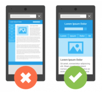
As we access websites on smartphones more than ever before, it is important to make a business website compatible with as many devices as possible. For example, the image on the left is where the design does not include responsive coding, whereas the image on the right seamlessly fits on a mobile screen.
Therefore, your website must meet the needs of the varying screen resolutions of all these devices. But is it worth the extra effort and cost to make your website fully responsive?
Responsive web design matters, and here’s why
The obvious answer was given in the Office of National Statistics data mentioned above. Local businesses cannot overlook the fact that their users are accessing information about products and services on mobile devices. Having a website set for just one screen type could be fatal for generating more leads and sales, especially if the business is relatively new.
The second most important reason is that illegible texts and images give a poor impression of your brand identity. A business needs to present its best face on the web to showcase its capabilities to customers, business partners, and contractors. Without a professional outlook, you are risking the future of your brand success.
That is why you need to have a professional website design service to have a comprehensive design strategy if your business is based in the Midlands or surrounding counties.
Closely linked to the above, a third reason is that a non-responsive website creates a bad user experience. And as more than half of search engine traffic originates from mobile devices, a fixed webpage would put off most mobile users. Therefore, to appeal to a wider audience, your website needs to have a responsive design.
As with most things in the tech world, it all comes down to finances. Over the last few years, mobile devices have become the primary source of advertising revenue. Even as we gradually move out of the lockdown, the mobile phone advertising market is estimated at $91 billion!
Practical points to discuss with your web designer
Opting for a Duda website over a custom-designed one can be quick and cost-effective. However, ensure that you verify with your developers that the Duda theme is fully responsive and meets the needs of mobile devices.
Things to look out for
Three key elements define a website's responsiveness.
First is the responsive design layout. Developers will test the layout of the web page that will be viewed i.e. portrait or landscape. Also, there will be a lot of testing to optimise the size, pixel range and balance of each page.
Secondly, videos and responsive images need to fit seamlessly into any screen size. Most YouTube video codes do respond to the existing coding of a web page. However, you should exercise greater caution when using custom videos or high-resolution images on your website.
Lastly, sometimes overlooked by many, is typography. The font size of the website should be compatible with the parent page width, so it can adapt to the screen of the mobile device and be easily readable.
Here at Kangaroo UK, the sites we build are all mobile-friendly by default. This is because we strive to deliver the best results for each customer, regardless of the web design options they choose. In case the above sounded too ‘techy’, do speak to our specialist design consultants, and we will take you through all the essential parts of a responsive website.